Most people are better speakers when they don’t use PowerPoint! Slides, pictures, and props have enormous power, unfortunately, most people are using them wrong. If you want to do it “right,” you only need two rules.
Because of the way software like PowerPoint and Keynote work, most presenters unknowingly create slides that actually compete for attention.
The problem of Attention
There is one very basic fact of human psychology:
You can only concentrate on one thing at a time!

Your conscious mind has a very obvious limit: ONE.
Many people feel like they can multitask well. What those people are really doing is flipping attention back and forth between more than one target every few seconds. Despite feeling competent at multitasking, studies show that it decreases performance. Your audience is not filled with multitask-capable alien mutants.
In other words, if the audience is reading your slide, they are not listening to you, and if the audience is listening to you, they are not reading your slide–at least not at the same time.
And here’s the dirty little secret: It’s easier to read the slide than listen to you. The path of least resistance is to NOT listen!
That means that most of the time when you show a slide with words, people are not actually listening to you. The only exception is when you are so charismatic and entertaining that it is easier to listen than read. Don’t bet on it!
The end result of most slide presentations is that the audience watches the slides and ignores you.
The following two rules are part of my SpeechDeck Public Speaking Skills system under the principle of “Manage the Theater.” This principle is all about managing the space around you.
Rule 1: Visuals are for the left brain

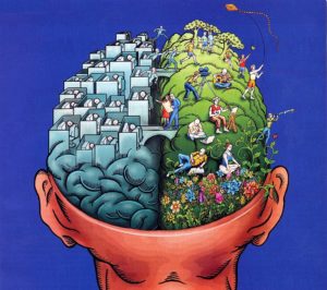
We’ve all heard about left brain / right brain. The left brain is the verbal and logical part of our brain, and the right brain is the creative and visual part.
While the actual scientific basis for this distinction is dubious, the concept helps me explain my rule.
It’s very natural to assume that great PowerPoint slides will entice the “right” brain. You might think you want creative slides and beautiful pictures to sooth the visual right brain. Wrong!
Of course there is nothing necessarily wrong with creative, beautiful slides, but the listener’s “right” brain doesn’t “need” it.
You can show my right brain a beautiful beach vacation, or you can just say the words “beautiful beach vacation.” Guess what, if you DON’T show my right brain a picture, it will picture an imaginary “beach” than is better than anything you can possibly photograph.
Right brain slides are always optional! “Right” brain slides are optional, and left brain slides are “right.”
The “right” brain doesn’t need help.
The left brain DOES need help.
The left brain is the conscious part that tries to figure out language, chronology, facts, statistics, and logic.
Even a simple misunderstanding in left-brain logic might upset your entire message. When you need me to understand something with precision (left brain) that’s when you should show me a slide, picture, or prop.
For example, the odds of winning the lottery are 1 in 13,983,816. You can help me understand by giving me a mental and/or physical picture. For example:
You can buy 560 fully loaded Honda Accords or play the lottery long enough to “maybe” win:
The visual helps give the left brain perspective. That’s why rule number one is about helping the left brain understand:
Rule 1: Eliminate the visual unless is 1) reinforces the verbal message OR 2) helps you understand the verbal message
The only way words on a slide will not compete with you is if they are exactly the same as the words from your mouth (reinforce). If you need no words, show a visual only to help the left brain understand.
I first introduced this rule in a previous post on Why PowerPoint makes you a worse speaker
Bottom line: Showing visuals to the “left” brain is the “right” way.
Rule 2: Keep it simple
 The presenter stands up and turns on PowerPoint. The first slide is a long quote that fills the entire slide. The speaker decided it was more important to shrink the font and fit the whole quote rather than print fewer words large enough for you to actually read.
The second slide is a bulleted list of the speakers main points and the presenter proceeds to read each bullet to you.
You don’t remember the third slide because you quit trying.
You’ve been in that meeting and you know exactly what happens. If you pay any attention at all, you read ahead and then wait for the speaker to catch up. The speaker is competing with PowerPoint and losing.
The solution is simple:
Rule #2: Show only one point at a time
If you have a ten step process, don’t show all ten steps. Don’t let me read ahead. Show me one step at a time so that the words on the screen exactly match the words from your mouth (see rule 1 above).
You can put each step on a separate slide or just reveal them one at a time, as long as you only show one at a time and still obey rule 1.
Bottom line: The “right” way is to feed the left brain one bite at a time.
Bonus rule #3
Rule 3: Eliminate everything else
Everything else is “wrong” (i.e. “less effective”).


