For some reason, mediocre speakers think facts and figures make them better presenters. Yet somehow, even after adding more facts and figures, mediocre speakers still sound just like everybody else.
Last week we discussed the least effective type of illustration–Explanation.
This week we’ll discuss the second of the 5 types of illustrations that you can use to convey your message–Evidence.
If you do it right, evidence (facts and figures) can make you look more credible, more authoritative, and more intelligent.
On the other hand, I’m willing to guess that you’ve also been to that know-it-all’s presentation with so much information that you sat there with only one thought:
I don’t care!
Have you seen that know-it-all? Do you respect him more? or less because of all the evidence he spews all over the office?
I can’t possibly enumerate all the ways that you can do it wrong, but here’s three:
- Other people’s knowledge
- Logical Argument
- Information overload
All of these problems lead to mediocrity because of one simple fact:
The purpose of evidence is not to prove your POINT. The purpose of evidence is to prove YOURSELF.
Let me illustrate …
Other people’s knowledge
 The most common mistake I see from mediocre public speakers is including statistics, research, facts and figures from others.
Isn’t that what they taught you to do in school? Always reference where you got your information? Of course! You have to give credit where it is due.
The problem is, that the more you talk about other people’s expertise, the more other people look like the expert instead of you!
The point of sharing evidence is to prove YOURSELF — YOUR credibility. Merely sharing evidence for the sake of evidence can actually make you look worse. This is especially true is you have to consult your notes, read the evidence from a slide, or hesitate to “make sure you get it right.”
If you want to use Stephen Hawking’s research to prove your point, why should I listen to you instead of reading what Stephen Hawking says about it himself?
Don’t get me wrong–you can and should use evidence. Just make sure you are establishing your own credibility and not someone else’s.
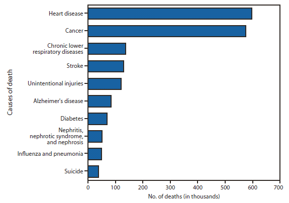
A mediocre speaker shows a chart like the one above from the US Center for Disease Control (CDC), then they begin to nearly quote the CDC numbers verbatim:
In 2010, a total of 2,468,435 deaths occurred in the United States. The first two leading causes of death, heart disease (597,689 deaths) and cancer (574,743) …
That’s the wrong way to do it because nobody actual cares about the exact number 597,689!
If you’re giving a speech on heart disease your goal it NOT to prove how many people die of heart disease, your goal is to prove that YOU know enough about heart disease to be trusted.
The actual number is nearly irrelevant. When you read other people’s information verbatim, all you prove is that you know WHO ELSE knows more than you.
All you have to do to retain credibility for yourself if make the information your own. MEMORIZE the most relevant evidence, reference the source, but present it as your own knowledge.
According to the CDC, 24% of deaths are from heart disease. I know that if you include indirect deaths from other causes, it’s even higher …
All that other information, and sometimes even the chart is just evidence for the sake of evidence, and will not help you.
Logical Argument
Another EXTREMELY common mistake from mediocre public speakers is to present facts and figures as proof in a logical argument that the speaker believes will convince the listener of some “thesis.”
 If you are actually presenting an academic thesis or dissertation, this may be expected behavior, but in real life, business, or social settings, that type of academic presentation puts people to sleep.
Academics want the evidence for the evidence sake. Remember, though, everywhere else, your goal is not to make the EVIDENCE credible, but to make YOURSELF credible.
There is a subtle, yet monumental difference between:
Academic: This research proves I’m not wrong
and
Persuasive: This research illustrates my point
The academic, in the interest of appearing unbiased, leaves open the possibility that he may be wrong, and indirectly invites the listener to doubt. This may be a healthy approach in the scientific method, but it’s also why it takes decades for the scientific consensus to be overturned.
Most presentations require more inspirational, fast-tracked results. In science the researched assumes the truth of her position and tries to disprove herself.
The persuader assumes the truth of his position, and illustrates it with confirmatory evidence.
There is a reason I call the proof an illustration, and not a proof. One approach assumes the presenter is wrong, unless he can prove the EVIDENCE is valid. The second approach assumes the SPEAKER is right because THE SPEAKER knows the evidence.
In most settings, you want the latter — because you are trying to establish your own credibility, not that of the evidence.
It’s not about the EVIDENCE; it’s about the SPEAKER!
Information overload
I don’t think I need to explain “information overload.” You’ve been there. You’ve seen it. You didn’t like it.
 More information doesn’t make the SPEAKER more credible. You only need enough information to establish your own credibility, no more.
Because once again … your goal is NOT to show the audience what all the information is, you’re goal is to show that YOU have all the information.
If you have everything, they need you! If you give them everything, they don’t! Give them just enough that they know you have more of what they want.
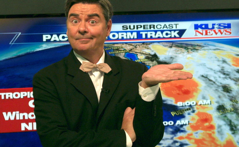
The weatherman
How would I coach the TV weatherman to include evidence. The weatherman doesn’t usually just say:
It will be a nice day sometime …
Credibility requires names and numbers:
Saturday it will be 82 degrees by noon
The name is “Saturday” and the numbers are “82” and “noon.” Names and numbers make you more credible — they are evidence.
Of course, any wanna-be-weatherman with no real credentials can read that off the screen, or from the National Weather Service (NWS). The more persuasive weatherperson will learn how to make the names and numbers his or her own:
The NWS models say it will be 82 degrees by noon on Saturday; Based on the lower stratospheric winds, I forecast you’ll have an about 5 degrees warmer Sunday.
This weather report delivers the message, but also builds the credibility of the messenger, because the weatherperson shares his own evidence “I forecast” with specifics “5 degrees” and “Sunday” in addition to someone else’s. Also the messenger throws in specific names “lower stratospheric winds” to prove his or her own credibility.
Warning: If the weatherman looks like he has to read it, he looks like a wanna-be. The words only work if they appear to be coming from the weatherman and not from the teleprompter.
We as listeners probably don’t care to understand about the “lower stratospheric winds.” What we do care about is trusting that the weatherman does!
Likewise, your boss doesn’t usually care about all the evidence in your presentation. He or she doesn’t want to know it all, but your boss does want to know that you do.
The purpose of evidence is not to prove your POINT. The purpose of evidence is to prove YOURSELF.
The evidence only helps if it has your fingerprints all over it!
Mediocre presenters think evidence by itself will make them better communicators. It won’t! It take 5 types of illustrations to rise above mediocrity:
- Explanation
- Evidence
Next week we’ll make the most of number 3.