

The idea of reincarnation is hopefully that you come back as someone or something better! So if we take the typical PowerPoint slide out back and put it out of it’s misery, what better form will it take in the next life?
In this series we’ve already discussed two rules:
Rule #1: No slides for inspiration
Rule #2: Show one point at a time
You’ll never reach the pure blissful enlightenment of PowerPoint Nirvana without rule 3.
Rule #3: Illustrate the Point
If you’ve followed the rules so far, you will only use PowerPoint when you need to enhance the understanding of important INFORMATION.
- Inspiration doesn’t need a slide, so most of your slides will only be informational
- You’ll convey that information ONLY ONE point at a time
Therefore, as explained in a previous post Visuals Done Right, the purpose of most of your slides will be to help someone understand the point you are trying to make.
It’s NOT about how beautiful the slide is.
It’s NOT about how much information is on the slide.
It’s NOT about the color, or font size, or layout.
It’s about ONE and only ONE thing:
Does the slide Help the listener UNDERSTAND the message?
Your slide can ILLUSTRATE your point in 3 ways:
ILLUSTRATE keywords
You don’t have to be an artist. The first purpose of a PowerPoint slide is simply to reinforce your message. Put your message on the slide. You want the audience to HEAR and SEE the message.
For example, what if you made a PowerPoint presentation out of this blog post? Most people would do something like this (errors and all):
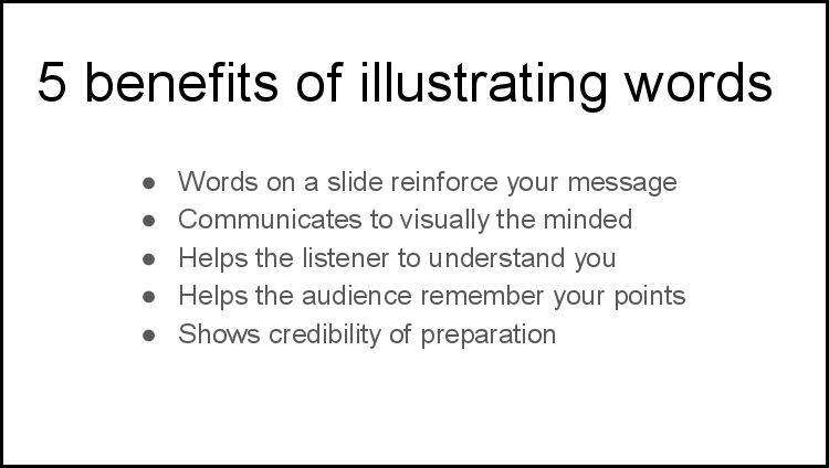
That is NOT an illustration! That’s just words!
Not only is the example above breaking rule number 2, and showing multiple points at the same time, but it’s not ILLUSTRATING or emphasizing any keywords.
To illustrate means to create a visual example. In this case I am asking for visual emphasis on the most important words. The easiest way to do that is to eliminate everything but your headline. Here’s the replacement slide:
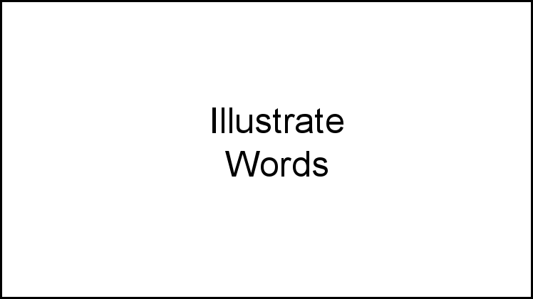
That’s an “Illustration.” What’s the difference?
There are 2 HUGE differences:
- Even though it’s just words, it is an “illustration” in the sense that is has a “visual” if not artistic component.
- It has few enough words that the key “words” are emphasized — because only the keywords are included.
In other words, it “illustrates keywords.”
In the bulleted list example, you’d be hard pressed to find a single word or two that everyone in the audience would agree was the “key” word.
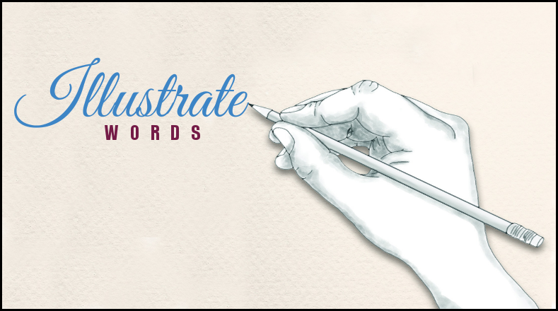
If you do have an artists help or have an artistic talent, you can up the visual impact:

Is that necessary? NO! I’m just showing an example of making the words more visual. I’m no artist. I can’t even draw stick figures. Regardless, just by changing a font or color or EMPHASIS, you can turn words into an “illustration.”
ILLUSTRATE with pictures
The second type of “illustration” is an actual “illustration.”
Simply by adding relevant pictures to your slides, you help people understand. Research studies have shown over and over again that a when visual representations are added to words, that the recipient learns more, learns faster, and remembers more.
You don’t have to have a perfect picture. Any picture will do–as long as its relevant. Don’t try too hard. I found this simple picture on pixabay.com, a site full of free-to-use images:

You don’t even need words. If you are talking about “illustrations,” show a picture of “illustrations.” As long as the picture is related to the words coming out of your mouth, you will be reinforcing your message, making it easier to understand, and making it more memorable.
Of course you can do both. I like to pair my pictorial illustration with words:
No, that is NOT a title slide! Most of the time, ALL my slides are that simple, and that simply visual.
This is what I would use instead of the bulleted list above. You can still say out loud all the things in the bulleted list, but the purpose of the slide is not to list all the information. The purpose of a slide is to “illustrate” only the information you want them to remember.
If you really think they need to remember all five items on the bulleted list, then showing all five bullets on a slide won’t help. Either they have to write it down, or you have to write it down for them and pass it out.
The reason I can remove the bullets is because I’m using the bullets to persuade you to “Illustrate your keywords.” I don’t care if you remember those bullets as long as you remember to “illustrate your keywords.” I still talk about those bullets, but the only thing I show you visually, is the thing I want you to remember: “illustrate your keywords.”
Illustrate Explanations
Frankly, the two types of illustrations above are optional. You can give a perfectly excellent presentation without any of the above slides.
On the other hand, if your topic is complicated, confusing, or highly analytical, you need visuals to help you explain things.
A picture is worth a thousand words. Right? This is where charts and graphs and diagrams come in.
When developing slides, the number one question should not be how to include all the information on the slide, but rather:
What ILLUSTRATION will make it easier to understand?
The previous examples with words and pictures make your verbal message easier to understand by REINFORCING or REPEATING the verbal message with an “illustration.”
But sometimes, reinforcement isn’t enough, and you need a picture to complement, supplement, or otherwise help you clarify the explanation.
100% of the time, statistics and numbers are easier to visualize as a picture than as words. You may be a number person. Great! Just know that most other people are not. Most people understand pictures A LOT easier than numbers.
Don’t JUST say the national debt is $20,000,000,000,000; illustrate it: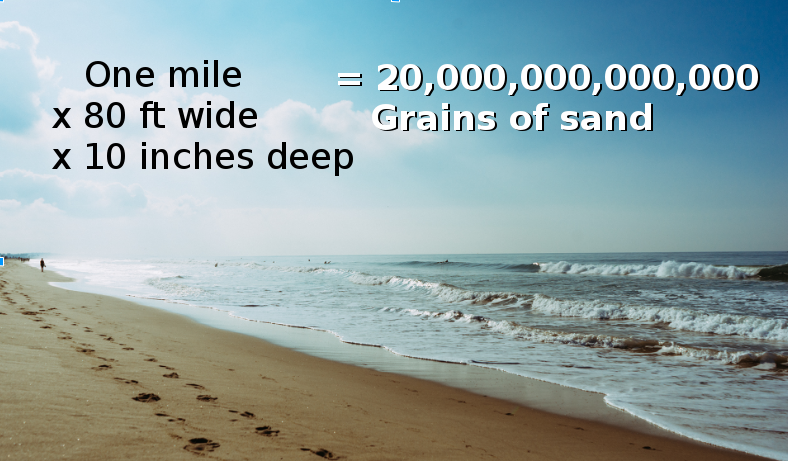
If you give information without the illustration you’re just a vending machine. Anyone can stand in front of the room and dispense bulleted lists and numbers. A vending machine presenter is the very definition of mediocrity.
The mediocre presenter leaves all the responsibility to the audience. An excellent presenter understands that it’s the presenter’s job to make the information easier for the audience to understand. That’s one huge difference between presentation mediocrity and public speaking excellence.
3 Rules of PowerPoint Nirvana
Your audience will continue to be trapped in PowerPoint hell unless your next reincarnation escapes the doldrums of presentation mediocrity. You can escape with the three incarnations on the way to PowerPoint Nirvana:
Rule #1: No slides for inspiration
Rule #2: Show one point at a time
Rule #3: Illustrate the point
That old-style PowerPoint presentation–bulleted and boring–is dead!
Break free from the drudgery of the default incarnation.
Break free from PowerPoint mediocrity.
Break free from the regression of bad Keynote karma.
There is a realm of consciousness in which your audience actually stays conscious during your presentation–and it starts with PowerPoint Nirvana.