
So you have to use a slide deck. You have some important information that you want people to remember and it needs to go on the big screen!
How do you do it right? How do you make sure that your presentation is closer to PowerPoint Nirvana than it is to PowerPoint Saṃsāra (aka:hell)?
First of all, you must consider rule one:
Rule #1: No slides for inspiration
Most of the time you don’t need PowerPoint at all, because most of the time your goal is inspirational more than informational.
Even if you think your presentation is informational, make sure you read PowerPoint Nirvana, part 1 to determine if you really need a slide at all.
Rule #2: Show one point at a time
If you accept the default settings in PowerPoint or Keynote your slides look something like this:
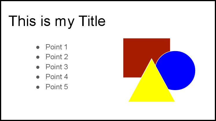
Somebody at Microsoft in 1990 decided to make the default presentation a BAD presentation, and they’ve never looked back.
Why is that bad?
Simple, ALL bulleted lists show multiple points, and nobody can pay attention to 2 things at once–and especially not 5!
Verbal vs. Non-verbal
If you were creating handouts, of publishing a book, it would make a lot of sense to create a bulleted list summary of your information. But VERBAL communication is different.
Written information can be detailed, complicated, structured just like a bulleted list. VERBAL communication should NOT!
A speaker can only talk about one thing at a time.
A listener can only think about one thing at a time.
If you have more than ONE point on the slide, I GUARANTEE that most listeners are NOT thinking about the same point you are talking about.
The listener can read faster than you can talk, and when you show more than one point, the listener is automatically fast-forwarding your presentation to the next bullet point instead of actually listening!
The end result is either:
- If all your information isn’t on the slide, they fast forward past you and miss important information that you say OR
- If all your information IS on the slide, they fast forward past you, and leave with the impression that you needed to be fast-forwarded.
Nobody who sits in a movie theater and wishes for a fast forward button, leaves the movie telling people how GOOD it was! If you want a fast-forward button, that’s a bad sign.
For more information on presenting INFORMATION, check out my past post on “The big lie about INFORMATION.”
Solution #1: Animation
Solution number one makes me want to hurl. Honestly, I hate solution number one.
Animate your bullets
Technically, you can obey rule #2, and show only one point at a time, simply by setting your bulleted list to display one bullet at a time. In that case the audience only sees the next bullet when you are ready to talk about the next bullet.
If you give presentations in and organization that expects or requires bulleted lists, this may be your only recourse. It is technically a new incarnation of the typical PowerPoint presentation, but just barely.
Nothing about animating your bullets will get you to PowerPoint Nirvana. In fact, as you well know, overdoing the animations is exactly the opposite of Nirvana.
Solution #2: Point
Another option, when you don’t have time to make better slides, or in those situations when you’re forced to conform to the boilerplate treadmill of PowerPoint cliche–add pointers:
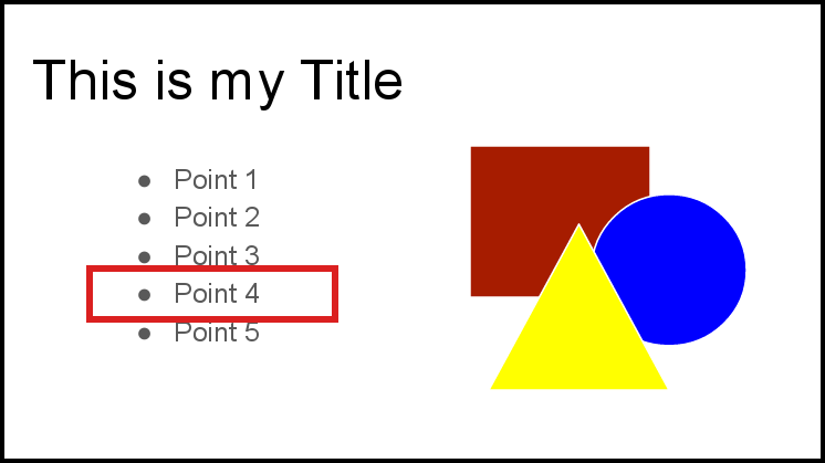
Point with a laser, point with your finger, point with a highlighter. Draw the outline in PowerPoint, Draw and outline on the screen, star it, animate it, highlight it, bold it, enlarge it, move it, etc.
Pointing requires a change of motion, and motion focuses attention.
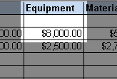
This is especially important when your slide has lots of information such as a spreadsheet. Make sure you are pointing to the part that you are talking about.
Animated bullets and pointing are better than nothing, but when at all possible, use solution three.
Solution #3: Separate Slides
The best solution, when possible, it to avoid putting extra information on the slide at all. Just don’t do it. If you are not talking about it, don’t make it visible on the screen:
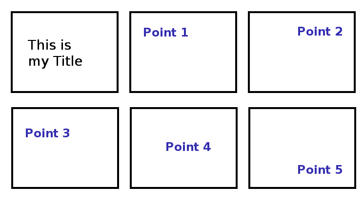
It really doesn’t even take any more time to separate your bullet points on to separate slides.
If you have more than one point to make about the same quote, or same statistic or same image, you can make multiple slides zoomed in to different areas, or highlighting different areas.
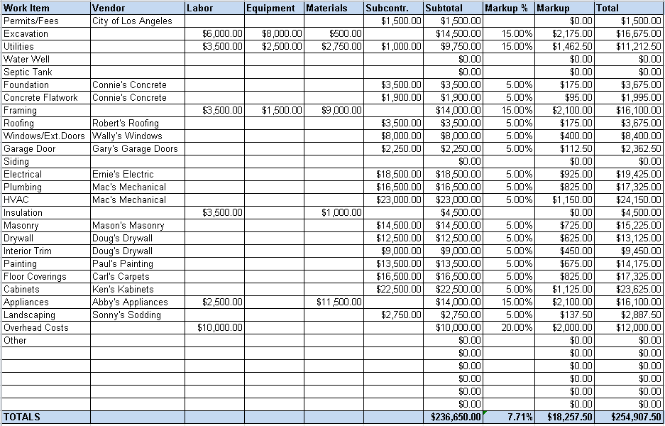
If your PowerPoint slide looks like that– you’re doing it wrong!
That is the kind of information you print out and pass out for someone to study alone when they have more time. You shouldn’t give that much information verbally. There are 200 cells on that screen, and you can only talk about ONE of them at a time. Show me just that ONE:
And then show me something else–on the next slide.
Approaching Nirvana
Leave the bulleted lists in the word processor where they belong.
Rule #2: Show one point at a time
Congratulations, in our second PowerPoint reincarnation you’re now two thirds of the way to PowerPoint Nirvana. More next week.